HBO Max

Launching a streaming service


You only get One Chance to make a first impression

I joined HBO Max in March of 2020, just two months before the service was due to launch. We faced significant headwinds such as; consumer confusion that spawned from the two previous HBO streaming products, we were launching with what was then the highest price point in the industry, and to cap it all off one week after I joined we were all forced to execute the most important product launch in the history of of the company remotely.

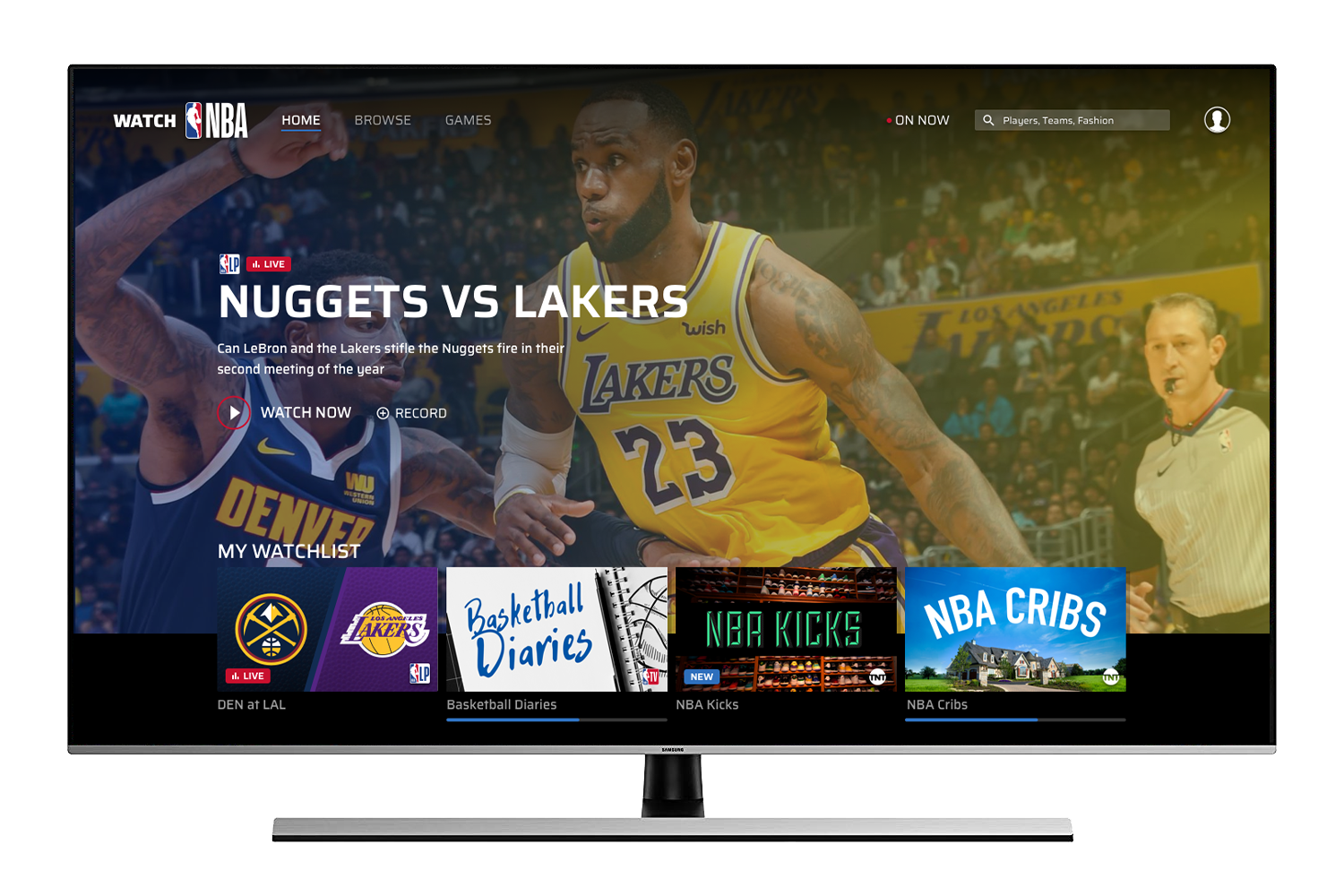
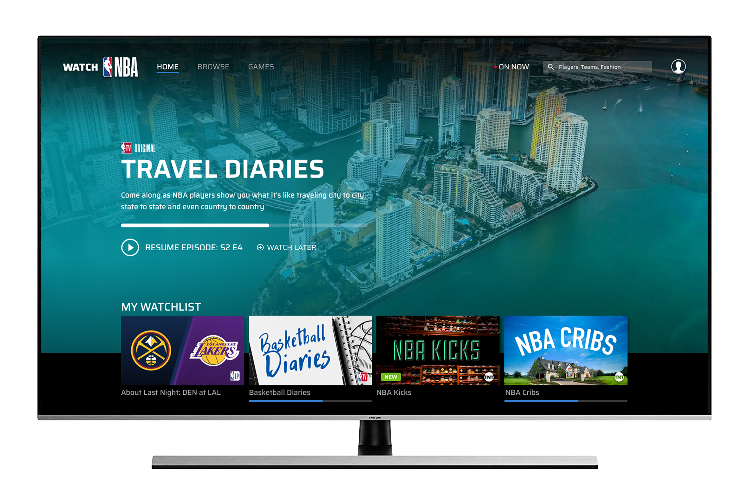
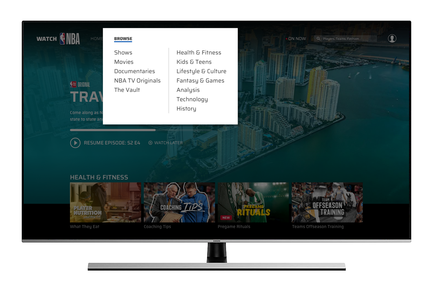
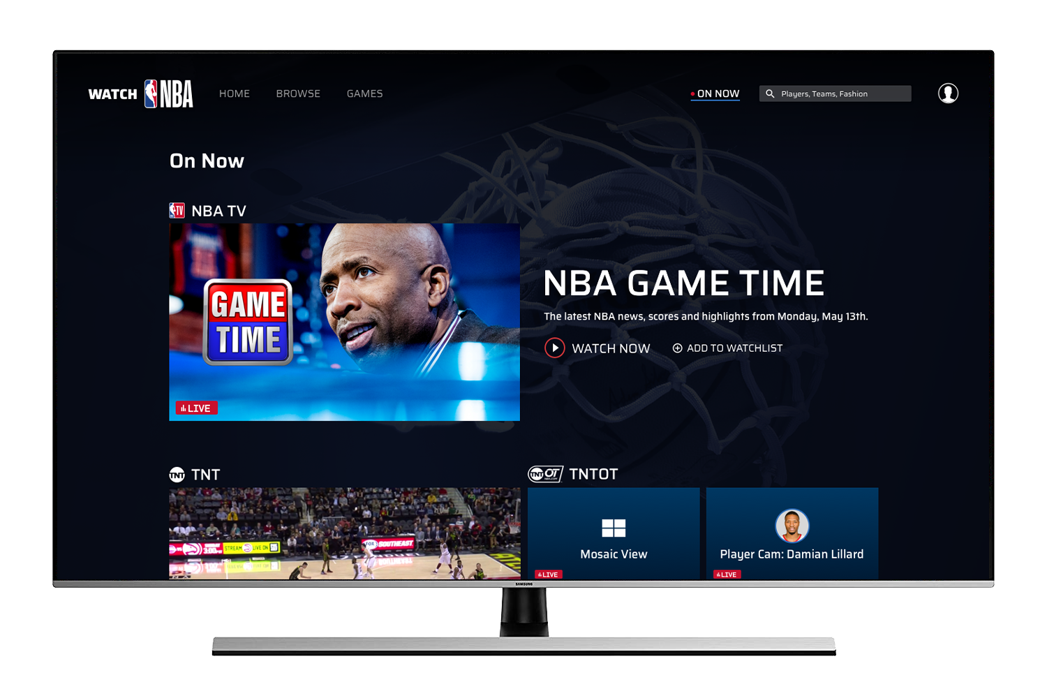
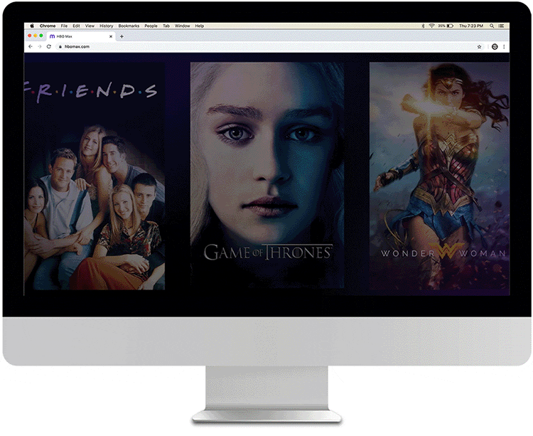
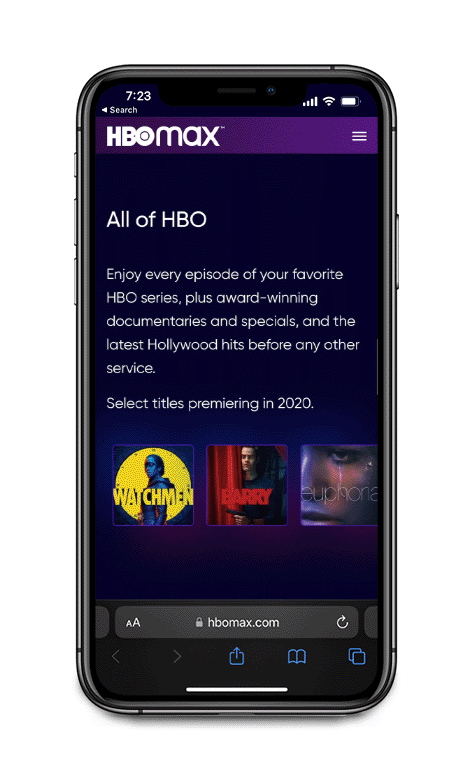
The majority of the marketing touchpoints whether they be social media, banner ads, tv ads, and emails– would all lead to one place HBOMax.com. I was in charge of the design of the homepage and 4 other landing pages that we created for the launch. Here the consumer would need to be informed about what the product is and convinced that it would be a must-have in their quarantine content diet. We needed to convey to potential customers what the new brand was and evoke a premium look and feel, worthy of the premium content HBO was known for. 

Same Day Premieres

 Executing design for the boldest move the film industry has ever seen


The most important initiative in the short history of hbo max

During the fall of 2020 Warner Brothers Pictures made the unprecedented decision to release its entire 2021 film slate on HBO Max the same day the films would premier in theaters. My team and I were once again in charge of a major marketing touchpoint, the Same Day Premiers landing page. Once again all of the other marketing channels would lead here and the page would need to excite, explain, and ultimately, convert visitors into subscribers. 


Watch NBA


Product design, basketball fandom, and experience with premium video products combined to influence the future of NBA video consumption.


Perpective-TV-02.png

NBA Direct to consumer: future vision

I was involved in a project to pitch the future vision of the NBA video product. Watch NBA is a subscription product that has hundreds of live games, a best in class video library, and original video content. This experience would go beyond the typical D2C offerings of recommendations, and personalization. Watch NBA would offer an exclusive enhanced game experience as well as participation in a shared community.

 NBA App

App design presents multiple challenges across various platforms and devices


draft-iphoneX-perspective-01.png

Draft & Playoffs on the NBA app

The NBA’s “Tentpole” events are vital to the business, and drive engagement throughout the year. The design challenge is creating a unique experience that remains consistent with established NBA branding while also following iOS/Material guidelines. If you want to check out these projects in greater detail click the button below.

NBA Design System

The Standings page was the genesis of our design system; a collection of reusable components that can be assembled together to build cohesive products.


NBA STANDINGs PAGE: CASE STUDY

Using data from the analytics team I learned that the Standings Page is one of the most visited destinations within our product. The page itself was pretty bare-bones compared to several competitors. I updated the design, but I also took it one step further than that by using the Standings page as a first step towards a design system. The cells used in the index on Standings have been implemented across our ecosystem in several different instances (Draft, Free Agency, Summer League, etc).


Design System on Responsive Web


THE NBA VIDEO EXPERIENCE

I was tasked with creating a video destination page for the entire NBA video-on-demand catalog. This site enhancement is a better user experience that generated more revenue due to the increase in discoverability, video starts, and pre-roll advertisements.

NBA TV HOME PAGE

The NBA TV homepage is the home of the live stream of the NBA TV linear channel as well as thousands of hours of NBA TV related VOD clips. It provides an amazing live video experience to users and also is a font of information about NBA TV.

NBA LEAGUE PASS - SALES SHEET

We used the design system to create a whole new sales sheet/storefront experience for users. The page serves two roles: it contains all of the information about NBA League Pass, and it serves as a marketing page for prospective customers.


Prototyping & User Testing


When tasked with redesigning the NBA Schedule page on mobile there were two schools of thought…


NBA Mobile Schedule: Version 1

The idea behind this approach is to display all of the information on larger cards. This differentiates our product from other competitors who have very little information on their schedule pages. It also allows for one tap navigation to other pages which are business priorities (“Watch'“ and “Tickets”).


NBA Mobile Schedule: Version 2

This option prioritized the information that was hierarchically the most important, and made the extraneous information available via a simple expand/collapse interaction. This condensed approach would allow users to see more matchups and would reduce the amount of scrolling needed to find what they were looking for.


UX Research Results:

Our first research objective was to test the filter systems’ functionality and whether or not users would want to use it.

All of the users were easily able to locate and interact with the Filter. Most reported they would use the filter so they could easily see only their teams.

I really like this filter. I think the ability to filter by TV provider is great, because I don’t have NBA League Pass, so I know I wouldn’t be able to watch those games.


The second research objective was to determine what user expectations were for the amount of information on page load and the type of information provided.

Users had a difficult time deciding, but ultimately they found the Version 2 more useful because they didn’t have to dig for more details.

I love Version 2. It’s very convenient, simple, and consolidated. It has all the information I need right there without extra clicking.

Oh, this looks like NBA.com. This is perfect. It has the matchups, logos–love that, times, but they also added the station and even its logo. It’s just pleasing to the eye. I really love this layout.

Art Direction

Directing the visual decisions that made the NBA’s fantasy product coherent in its aesthetic.


About the Project

NBA Pick‘em is a free-to-play game where users predict game outcomes, season win totals, player props, and more. The branding needed to differentiate itself from the overall NBA brand but without going too far. It was a tough balance to strike, so I directed designers to try styles that weren’t too much of a departure from the NBA’s style guide but still felt energetic and fun.

It began with me setting up a kick-off meeting with all of the designers and some other key stakeholders from the marketing and product teams. Together with the stakeholders I created a design brief and delivered it to the design team. I collected the assets and references that the designers would need in order to get started. I helped answer questions throughout the process and offered direction and feedback on different designs in concert with what I believed the stakeholders were looking for.

The results

The branding for the entire Pick’em ecosystem was a huge success. The stakeholders and I chose a direction but the NBA wanted the brand to be a little closer to their existing style. We also decided to include UI elements from each game within the branding and marketing units. After several iterations we delivered the final product for approval, and it was well received both internally and externally. I loved giving feedback on the array of great design options that the team came up with and pushing people in different directions. I believe we achieved a great result (check it out here in the wild).

Marketing & Branding

Infographics

Packaging